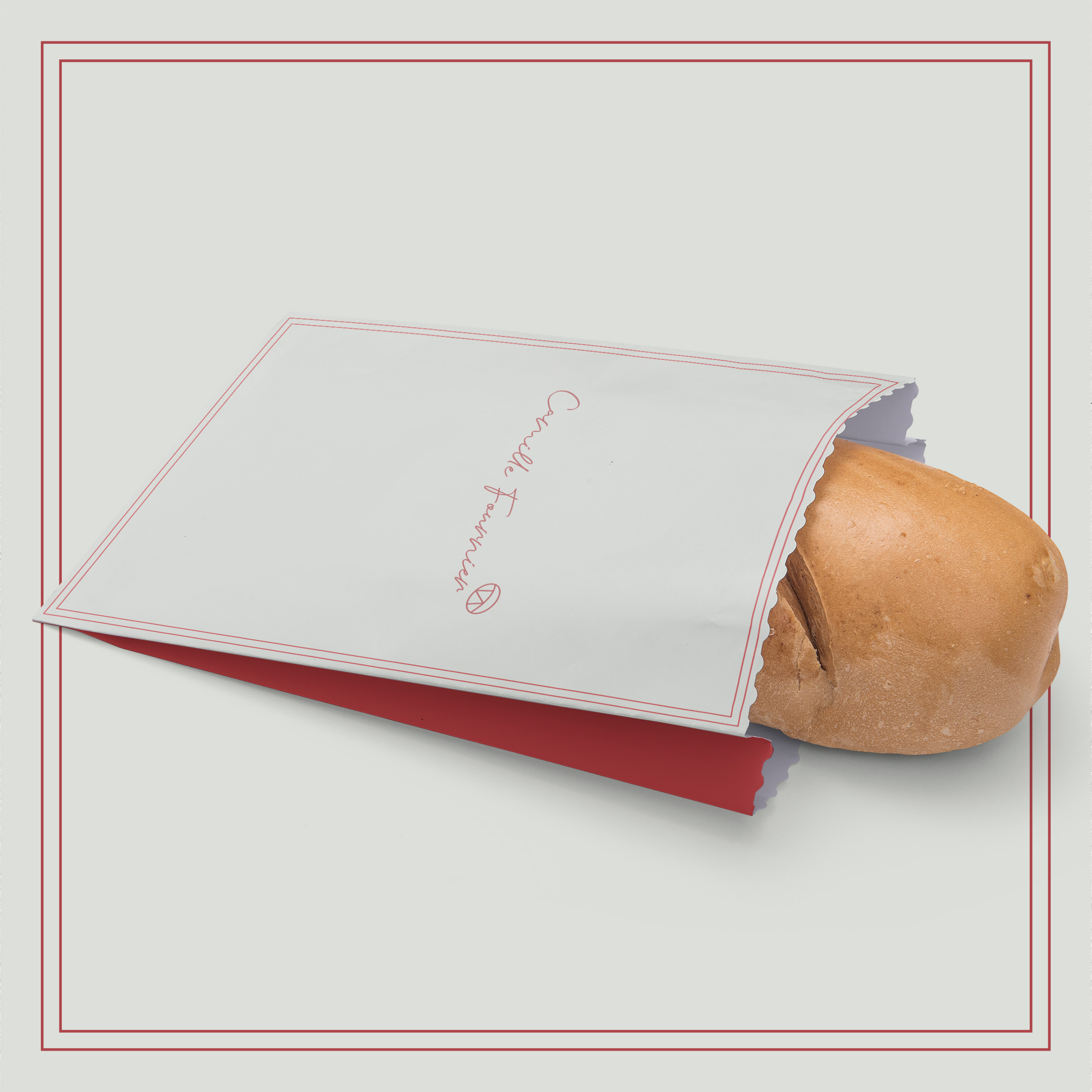
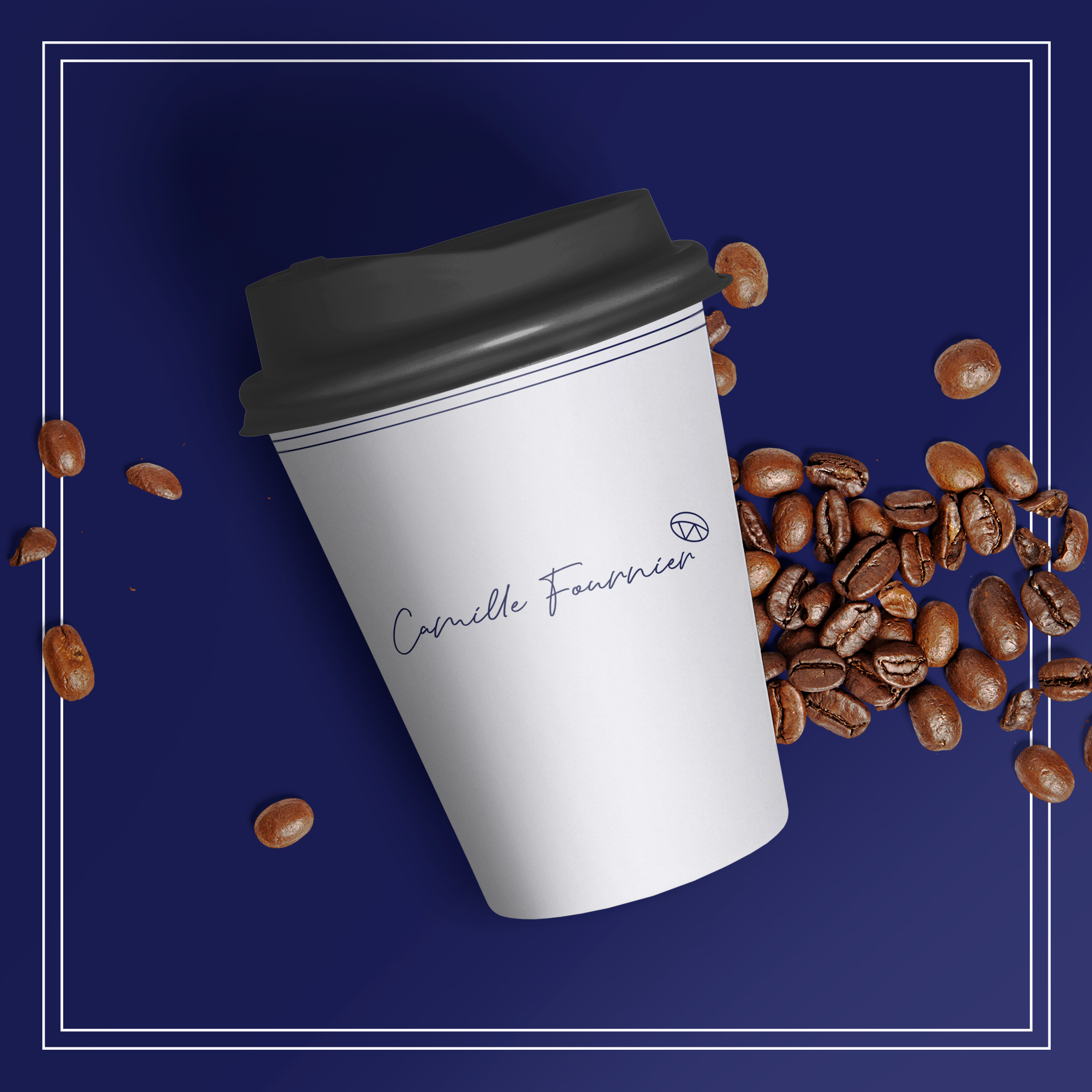
A bakery bringing Paris standards to the art.
Branding, Visual Identity, Photography
"We want to honour our grandfather by going to our roots in Paris and distinguish ourselves as a modern premium bakery within the GTA."

A signed legacy.
We wanted to have a classic script font and what better calling card to use than the founder's own signiture.
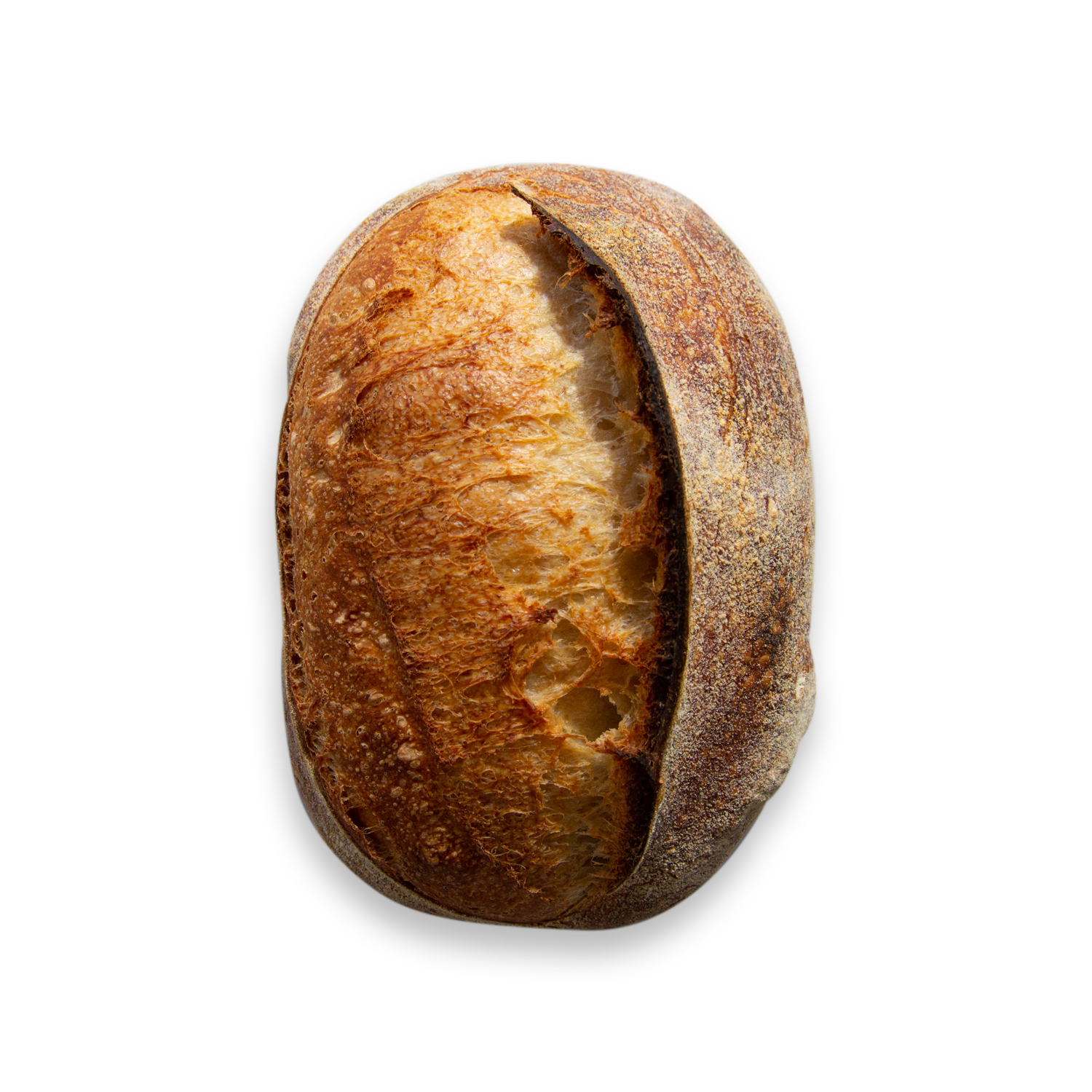
A flexible icon.
Along with the script an icon to represent the brand was needed. A loaf of bread in minamalist and simple style to feel welcoming and clean compared to the script font.

Colours picked from the source.
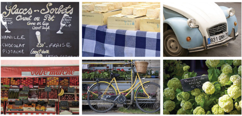
Print material, Digital or packaging, use a colour combination that will fit the product and the time of year.
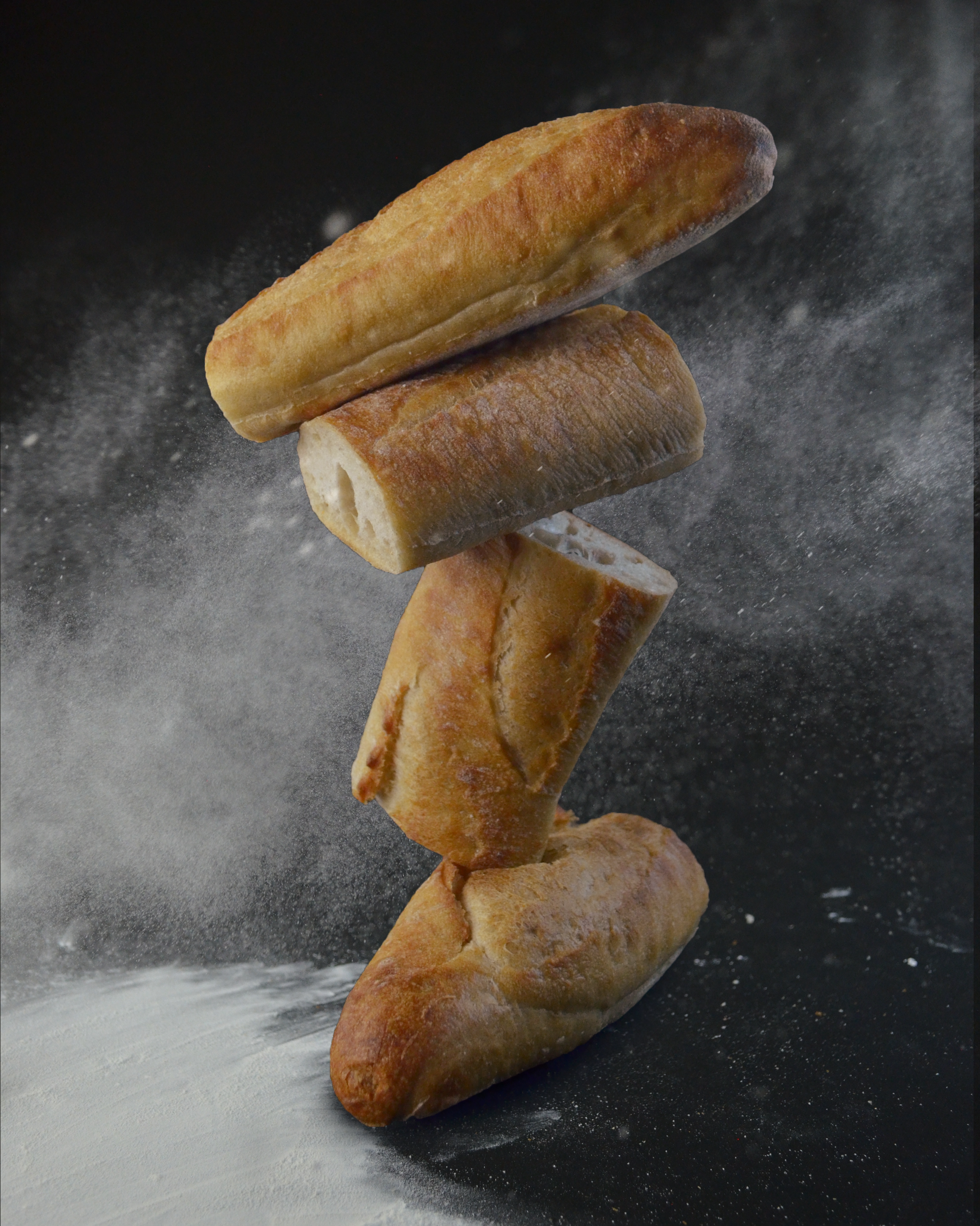
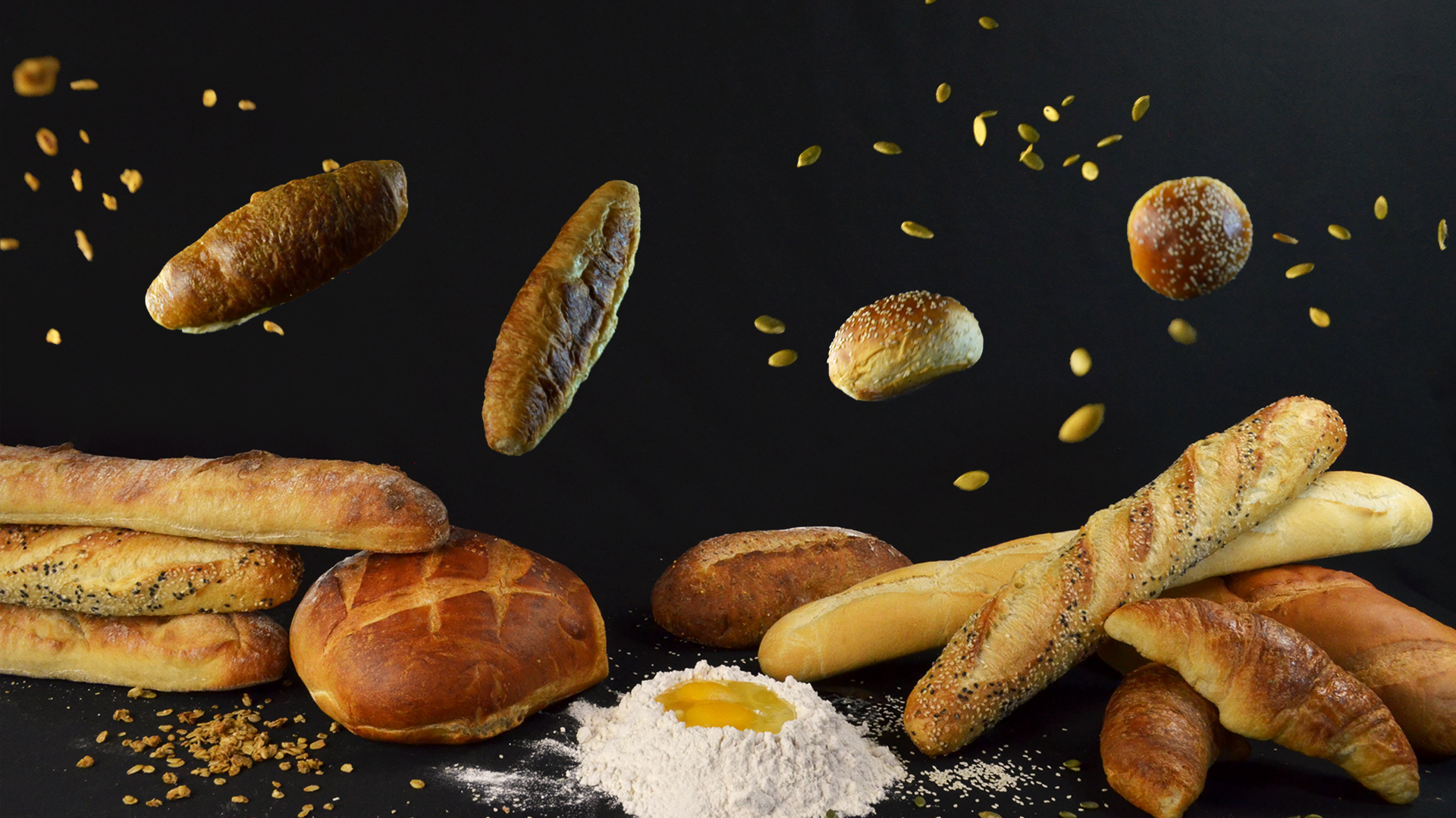
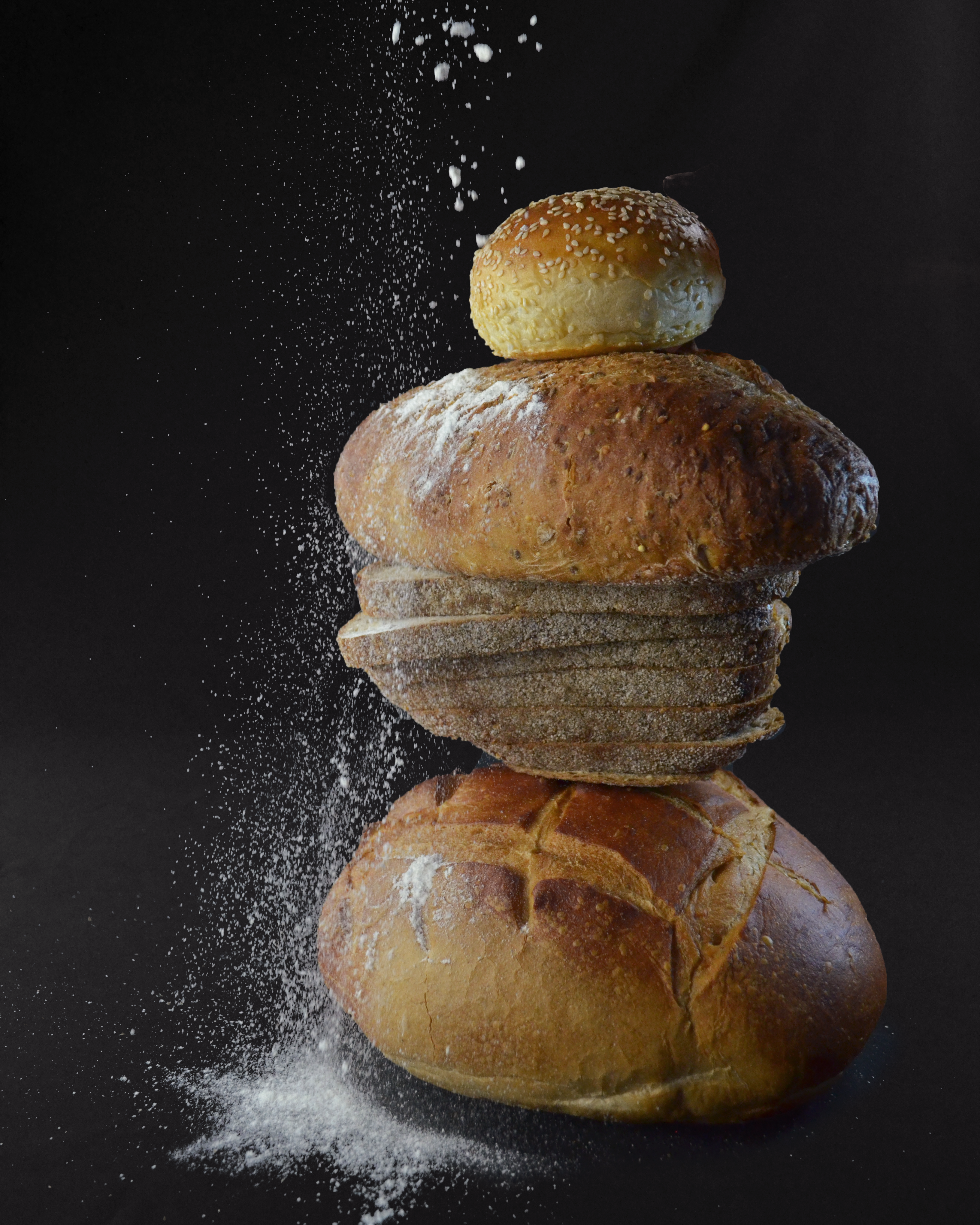
Dynamic Photography.
The local bakeries are boring. Plain and Simple. Using products in ways that the East side of Toronto hasn't seen before, with a goal to invoke movement and excitment.


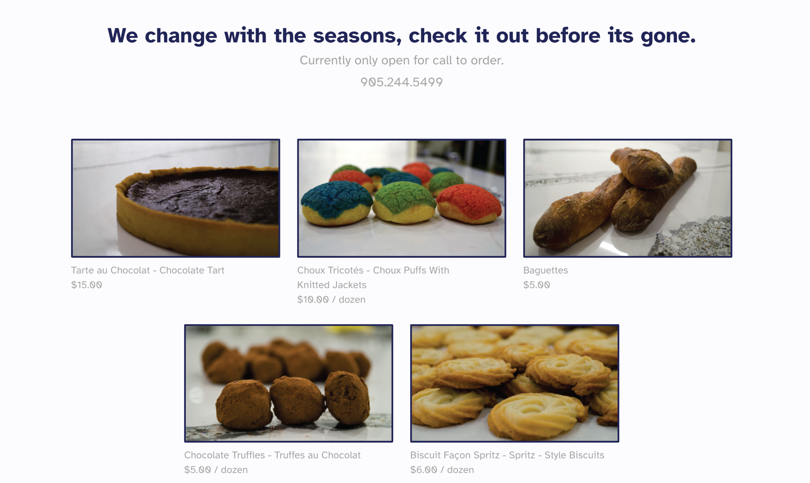
A clean website where
products show off.
Simple to navigate and find all the needed contact information and a straight forward call to order.

